Latest Work
Snapshots of current work
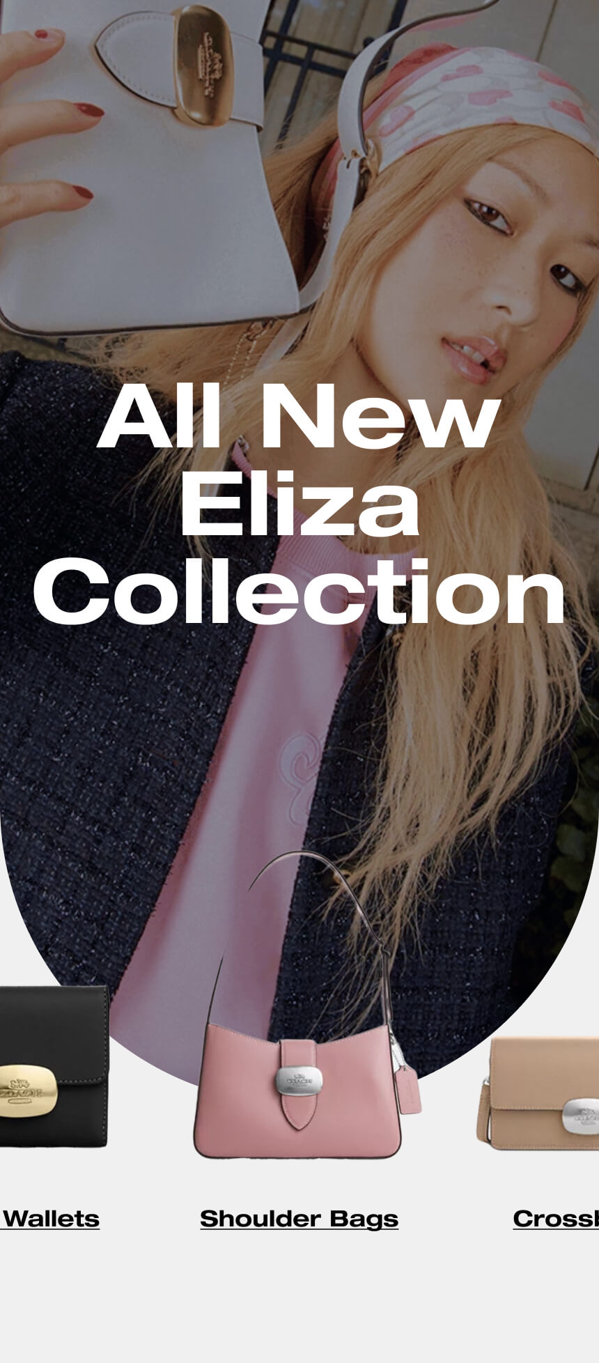
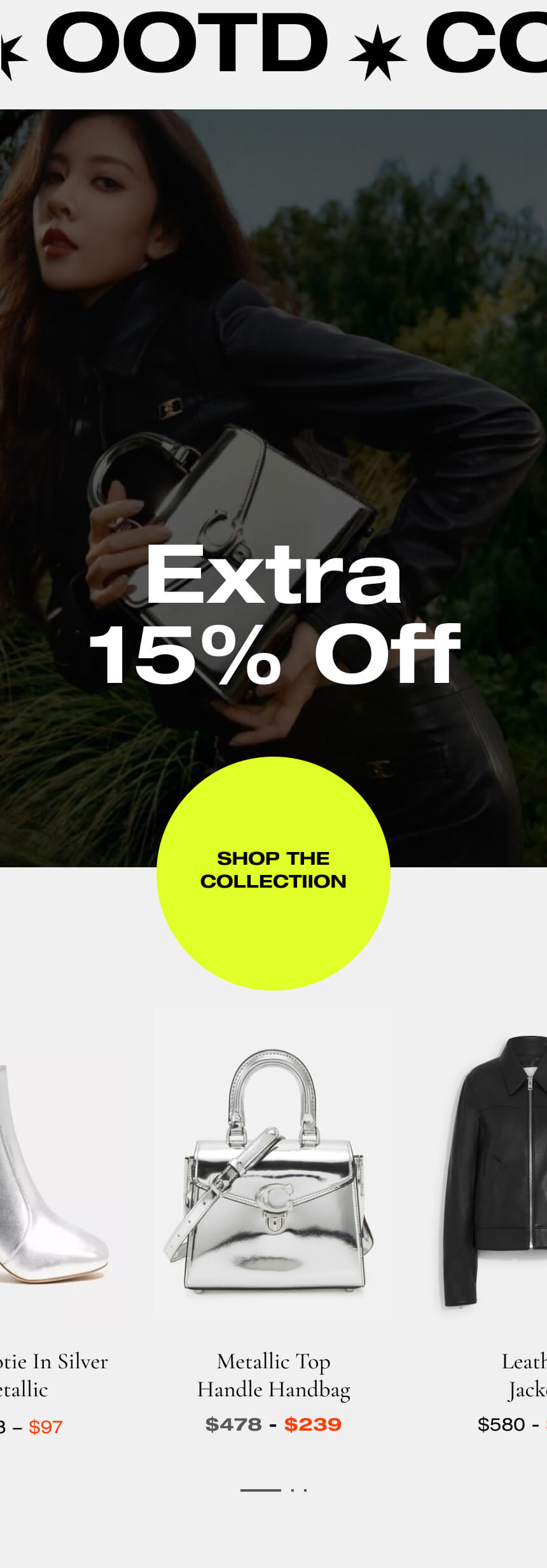
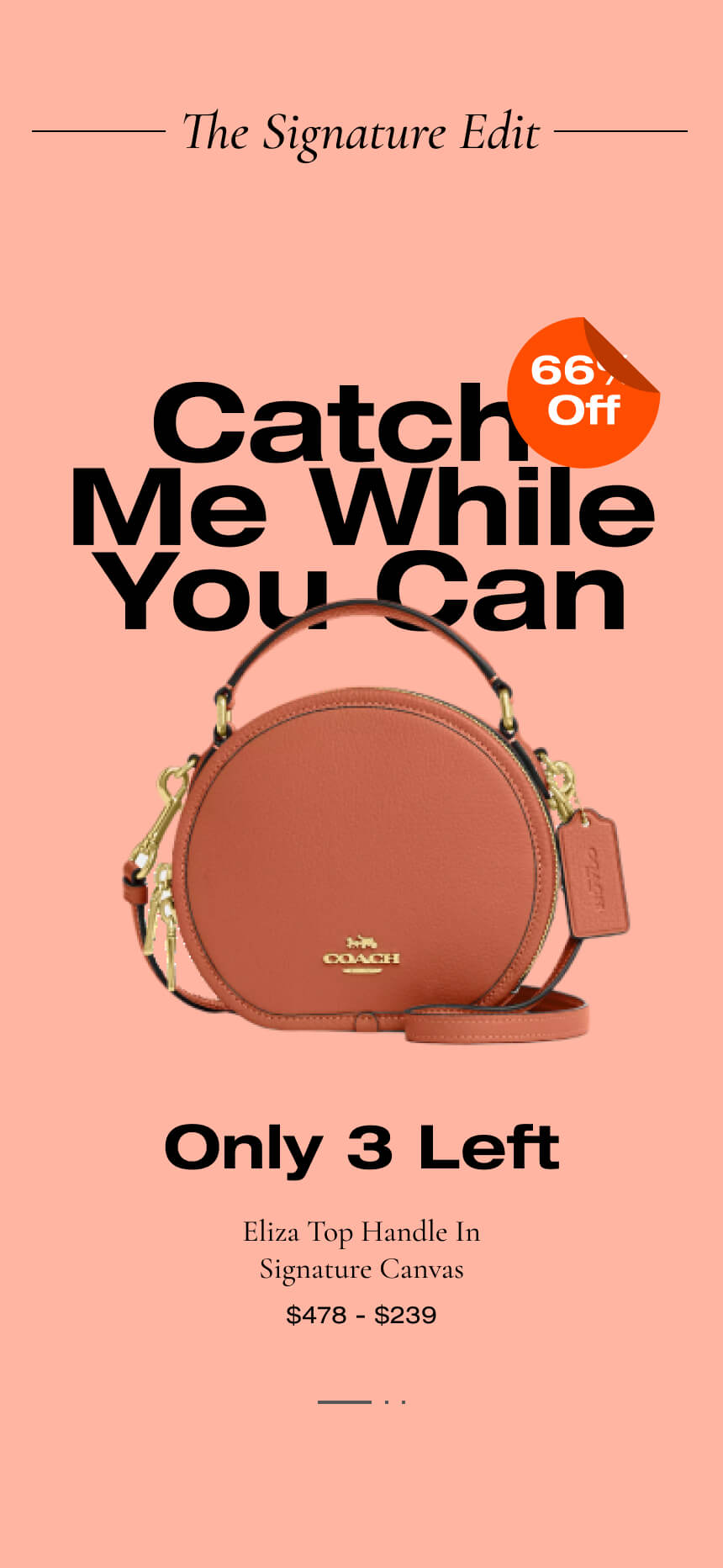
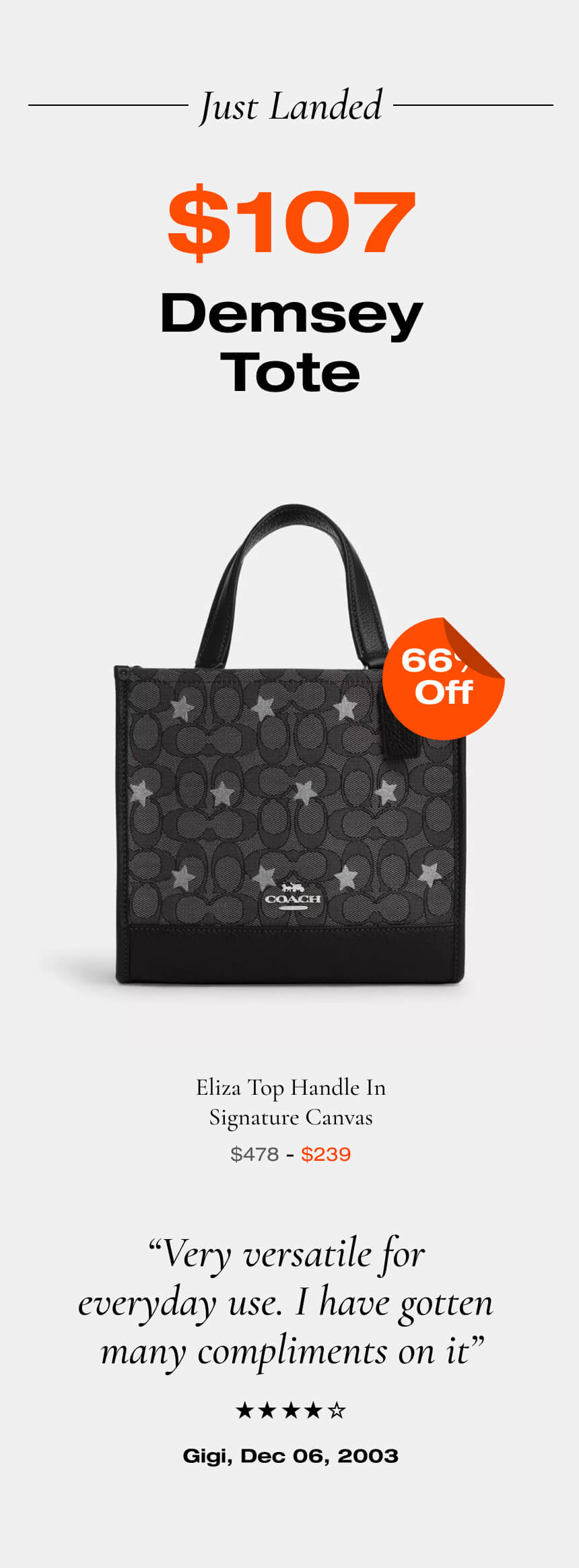
Coach & Coach Outlet
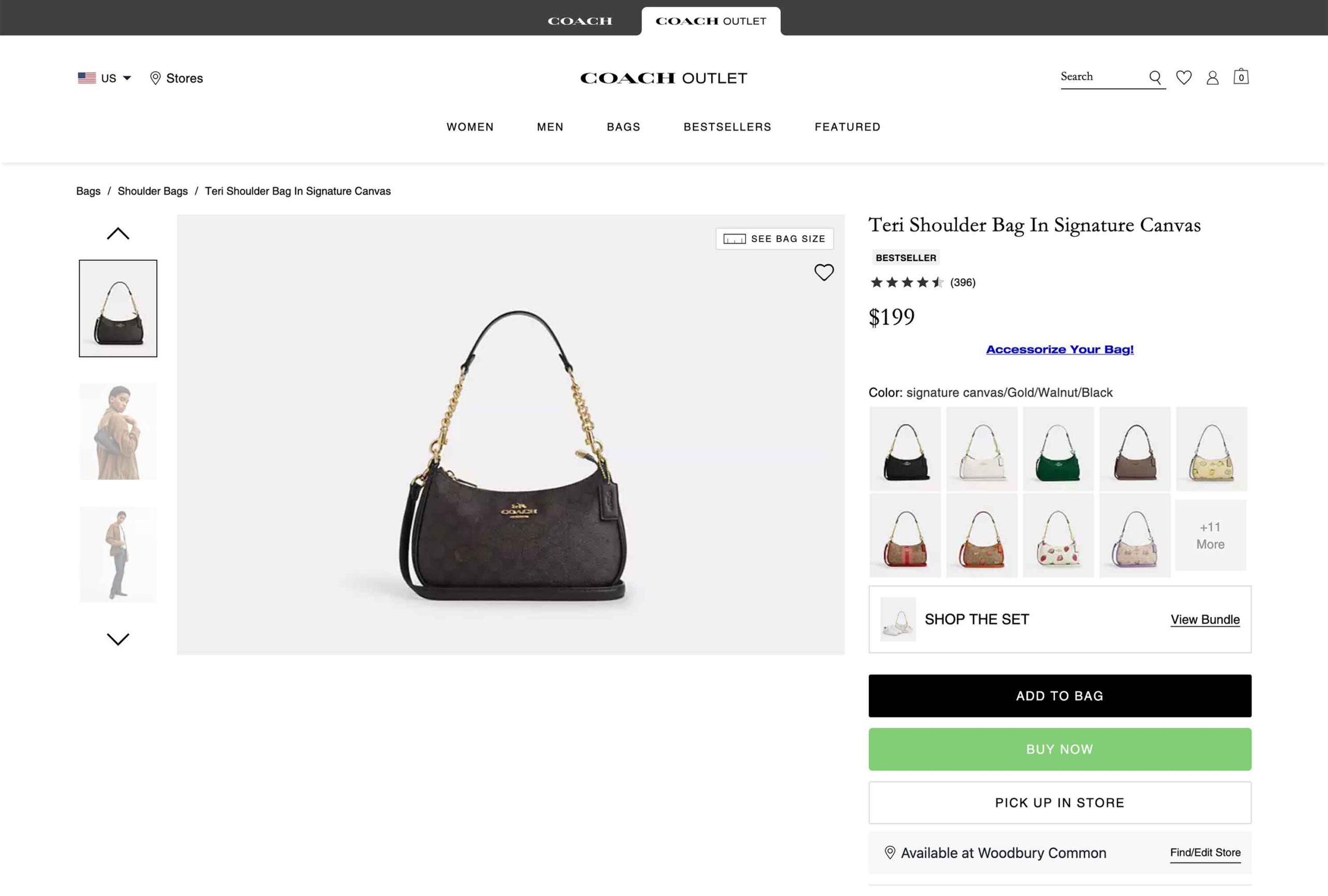
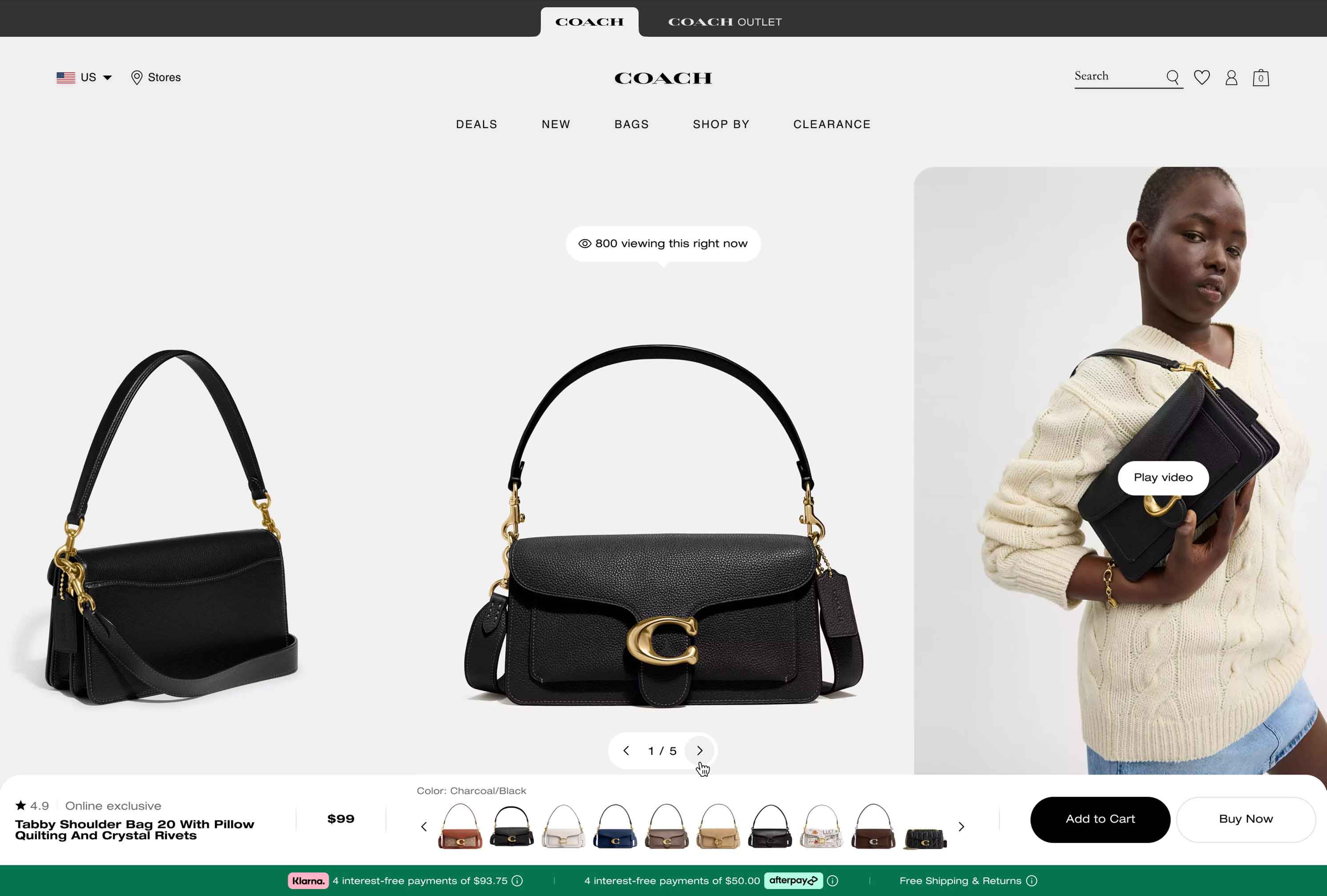
Product Detail Page
Product Detail pages are the heart of any E-commerce experience. We took this seriously by conducting a thorough value analysis of the current base experience and identified problems to solve.
We don't want to interfere with the customer's work, so we focused on elevating the experience and providing a more immersive and convincing level of visual details. The emphasis is on the product as the hero, and a unique layout that will serve as the new bar.
Role
Design and creative direction, supporting the boundary-pushing design from Jonathan Martinez. Focused on cross-team collaboration, usability, UX, accessibility, and working with product, User Research, and leadership to realize the vision.
Team
Jonathan Martinez, Principal Designer
A paradigm-changing design for Coach, this is the first significant redesign of PDP in 4 years. It boasts a vast gallery presence, and a multi-function bar consolidates product metadata and purchasing functionality in one convenient place.

The gallery and every detail were refined and optimized to focus on above-the-fold functionality. The parallax experience brings a sense of depth to the page.

Details are structured and more visual, providing users with additional information depending on their current mission stage. Providing more views on how to wear the bag with a Virtual Try-on feature helps customers visualize the products from their point of view.

Visual Product Details
We re-imagined and added a more visual details section, while still providing the details users expect. Through extensive user testing, it was clear that the visual aspects were desired, but some users still wanted the information in a structured list.
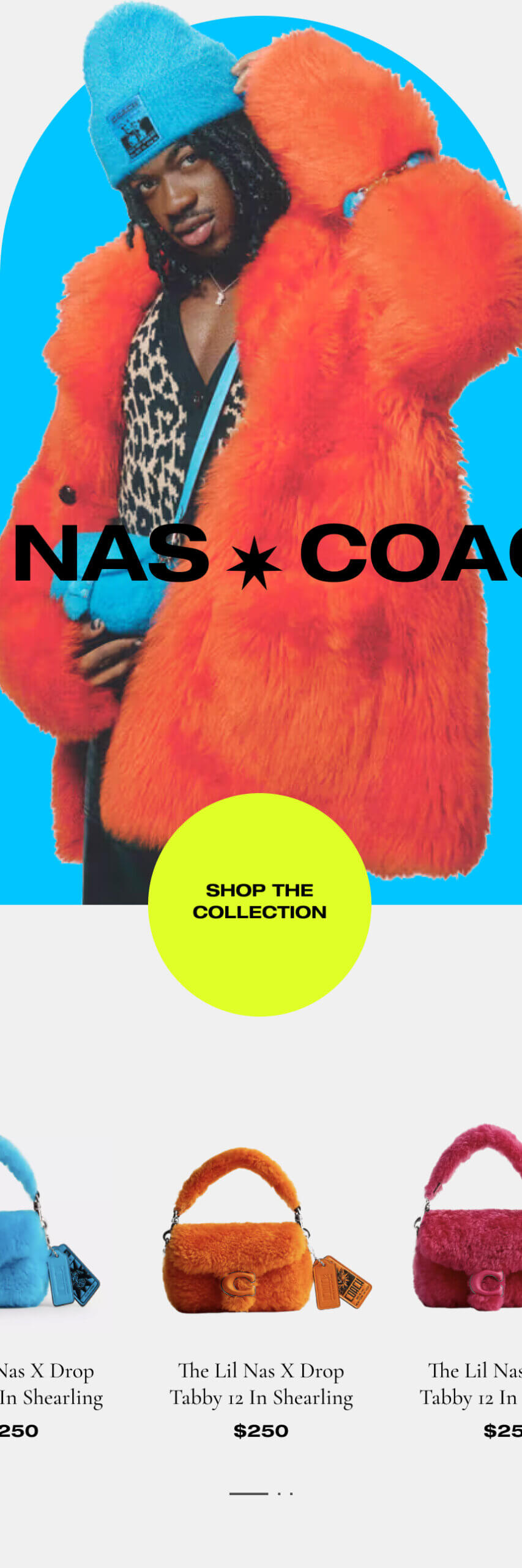
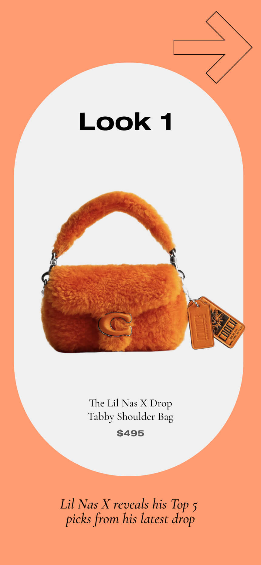
User Generated Content
Community is vital for specific audiences, particularly among Millennials and Gen Z. We are utilizing more creative modules to connect people and the brand.

PDP Before & After Slider
Coach, Coach Outlet, & Kate Spade
Product Listing Page
What went into the latest PLP for Tapestry brands? A thorough value analysis of previous state PLPs, data, UX Research, Baymard, Neilsen, and stakeholder requirements, to name a few.
The concept is for the PLP to be more shoppable rather than only a driver of Product Detail Pages. Major changes we made:
- A full-width, seamless background and elevated aesthetic.
- An overhauled filtering system with category wayfinding.
- Much-improved usability with fewer clicks and clutter.
Role
Digital Design and creative direction, leading the team on the strategy of several designers, activation, UX, and accessibility.
Team
Juliana Botero, Senior Designer; Jonathan Martinez, Senior Designer; Brinda Munuswamy, Product Manager
With the desktop experience, we went full-width and completely overhauled the filtering system.
The seamless mobile experience.
PLP Redesign Results
This template was a clear winner, outperforming the old design on desktop and mobile.
+12%
Page Click-throughs
+16%
Add to Bag Rate
+1.06%
Conversion Rate
Coach Outlet
Homepage
Shophouse's concepts helped shape Coach Outlet's future direction while we strategically integrated detailed design, usability, and reusability.
- We prioritized accessibility, motion, and refreshed typography
- Laid the groundwork for experimentation with strategic business goals
- Customer-centric vision in mind
Role
Agency guidance, Design Direction, and led the team in strategy activation, UX expertise, and accessibility for several designers.
Team
Hugh Connelly CD; Anna Parellada, ACD; Becca Mignanelli, VP E-Commerce; Jonathan Bailey, CD (Coach)
Gamestop
Site Concept
Future concept for GameStop. A collaboration with the CMO succeeded in lifting aesthetics to the current state. The goals were to bring gaming excitement to life and give new releases more visual prominence.
The gamer audience was deeply considered with a dark mode aesthetic while distinguishing the look and feel in the competitive landscape of gaming e-commerce.
Role
Digital Design and creative direction, directly collaborating with Gamestop leadership for a visionary future for Gamestop's homepage and site look and feel.
Team
Gamestop
Tapestry
Multi-brand Motion Style Guide
Motion is the special sauce in UI design that brings everyone together. We created a guide to align all the efforts to maintain consistency, define motion tokens, and give each brand its version of motion.
Role
Digital Design and creative direction, from the conception of the motion guide to the execution and systemized tokens.
Team
Jonathan Martinez, Principal Designer, Concepts, & Animator


Collaboration is a Superpower
Magical Graphical
©Jason Bishop
